

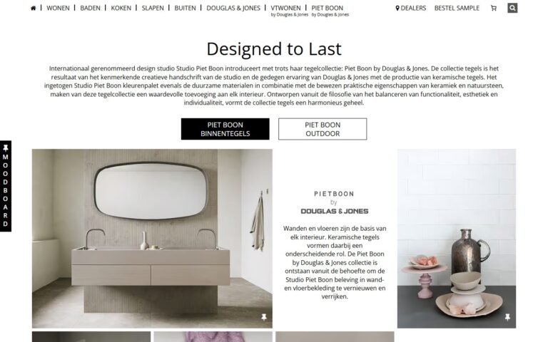
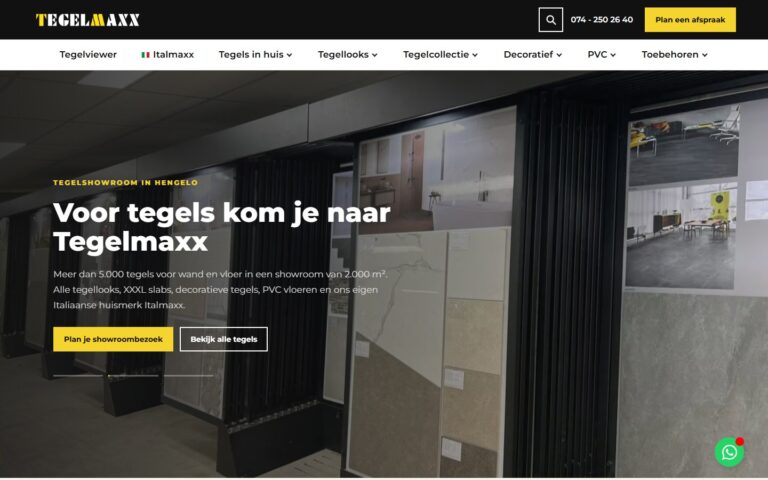
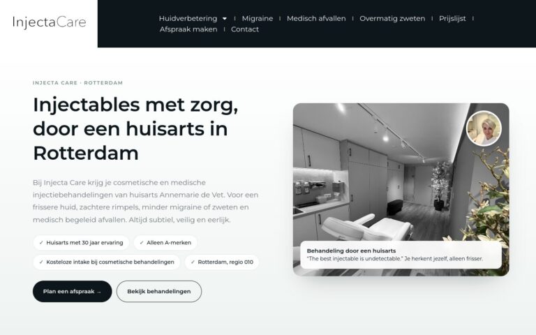
Readable typography with a clear heading structure makes reading easier and gives your website character.
What does this mean in practice?
Typography is about the choice and styling of fonts: the typeface itself, the size, the weight, the line spacing and the heading hierarchy. Good typography makes text easy and pleasant to read.
Why does this matter for your business?
Most of a website is text. Letters that are too small, lines that are too long or too little contrast make reading tiring, and visitors drop off sooner. Typography also gives your site character: elegant, modern or technical.
Examples and best practices
- Use no more than two fonts.
- Make body text at least 16 pixels on mobile.
- Keep a clear structure with H1, H2 and H3.
- Keep lines around 60 to 80 characters long.
How we do it at Ikoon
Because every Ikoon website gets a unique, custom design, we choose fonts and a heading structure that suit your brand's character. That keeps your site easy to read, on mobile too.