

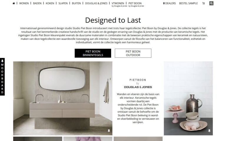
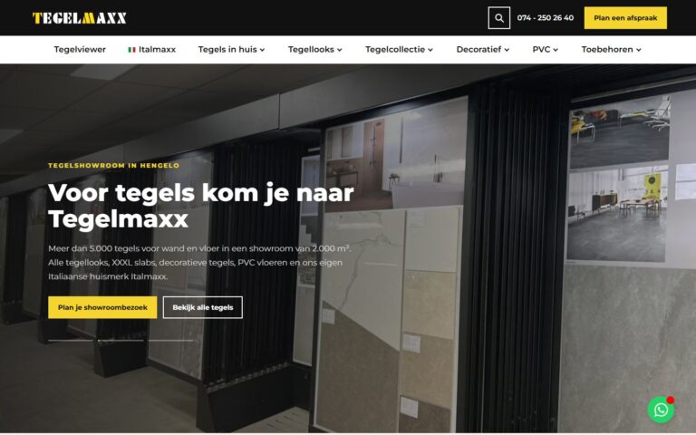
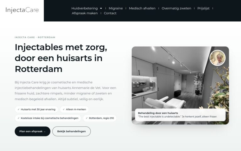
With responsive web design, your website is easy to read and use on any device. It is now the standard and a requirement for a good position in Google.
What does this mean in practice?
Responsive design (RWD, Responsive Web Design) is a way of building in which the layout, text size and images automatically adapt to the width of the screen, whether that's a phone, tablet, laptop or large monitor.
Why does this matter for your business?
Customers visit your site from different devices, and Google mainly looks at the mobile version. A site where you have to zoom in or scroll sideways costs you trust and enquiries.
Examples and best practices
- View your site on different phones, including with the screen rotated.
- Check that tables and photo galleries also work on small screens.
- Avoid elements that stick out beyond the screen.
- Adjust the font size to the device.
How we do it at Ikoon
Every Ikoon website gets a unique, bespoke design that is fully responsive, for phone, tablet and computer. You only pay once your site is live, so you can check it on all your devices first.